// project /
Scierie Badinter
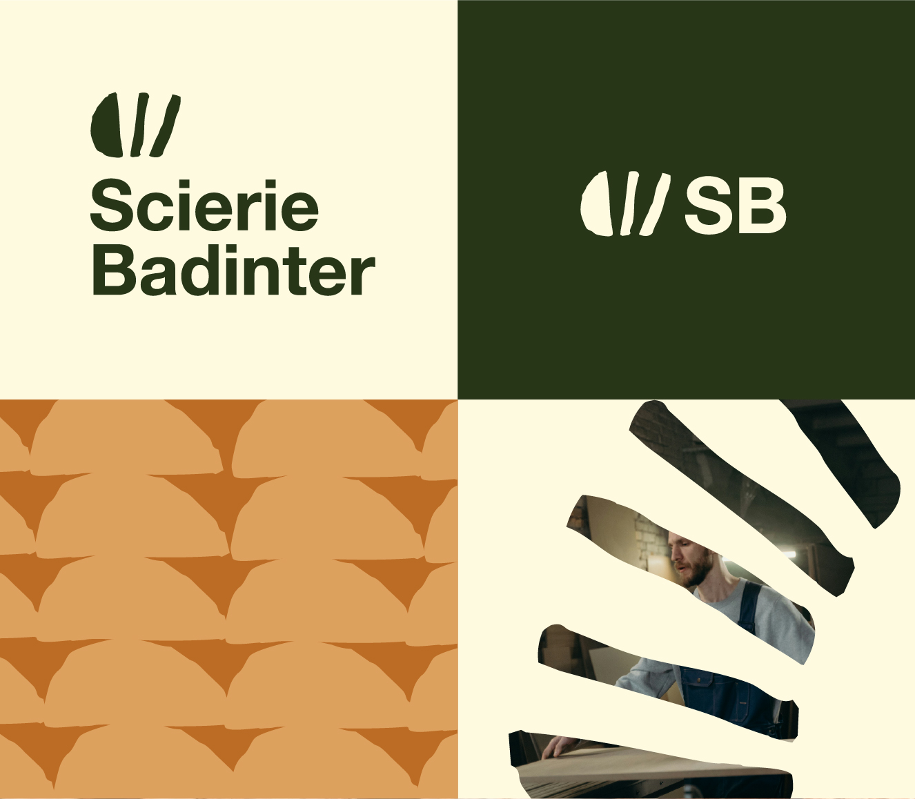
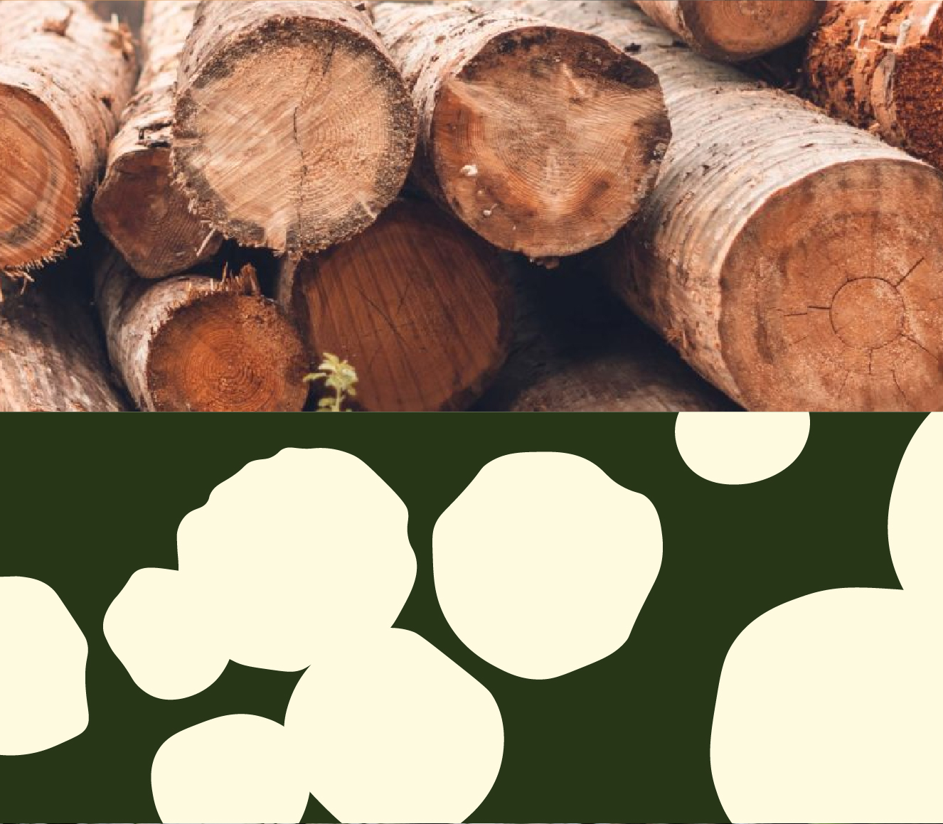
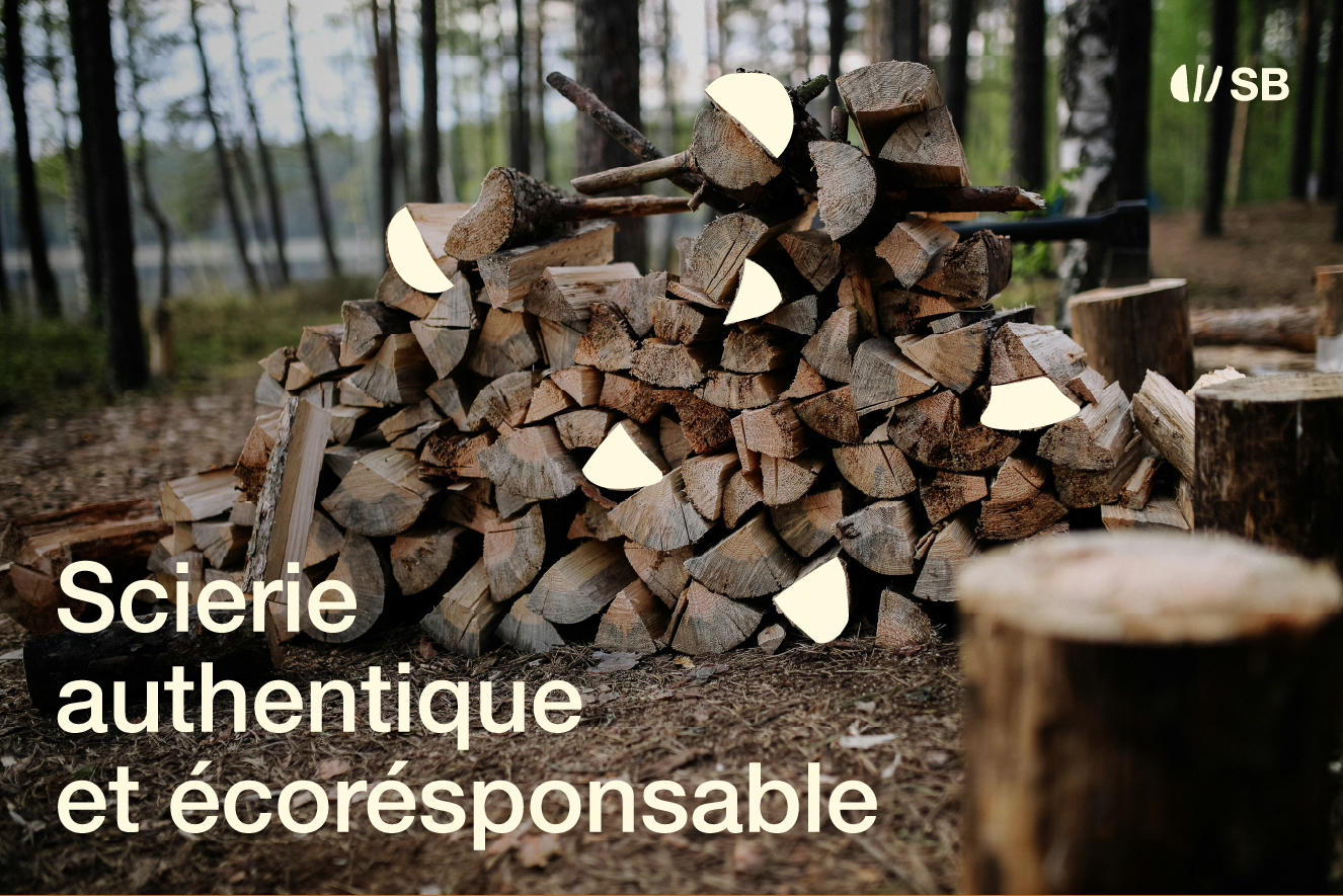
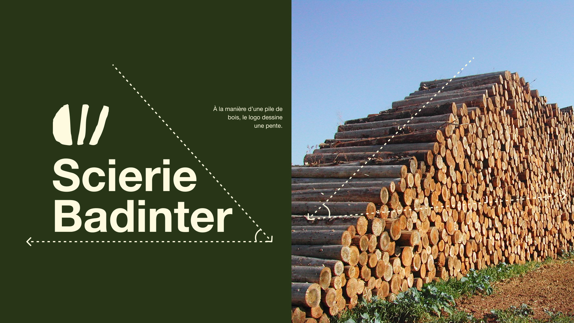
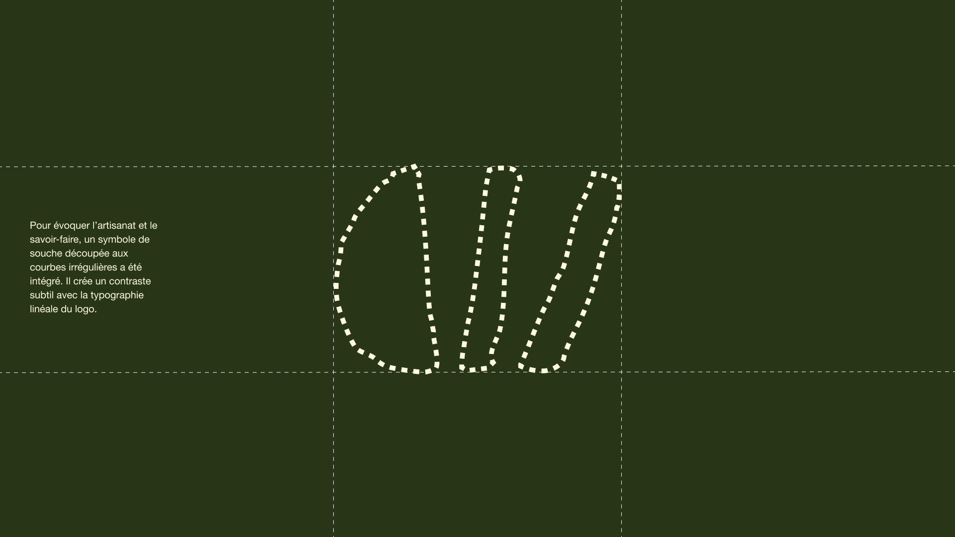
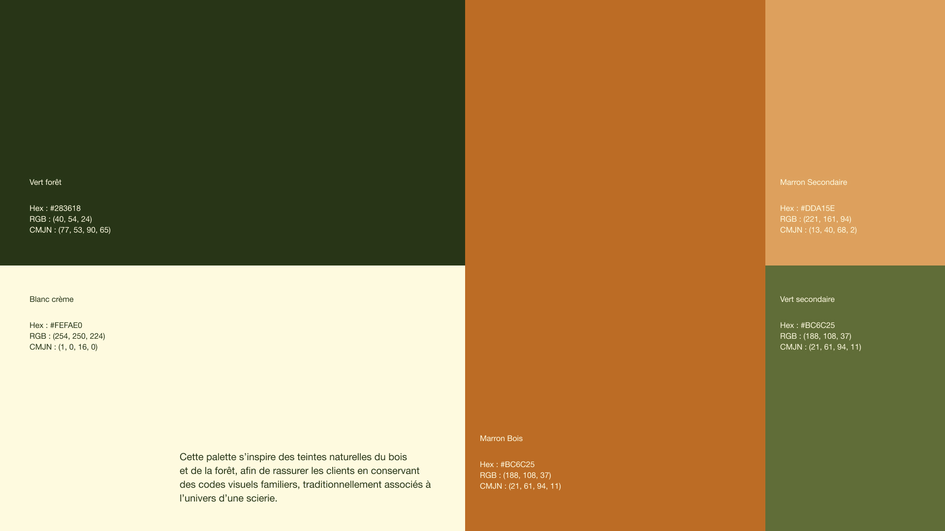
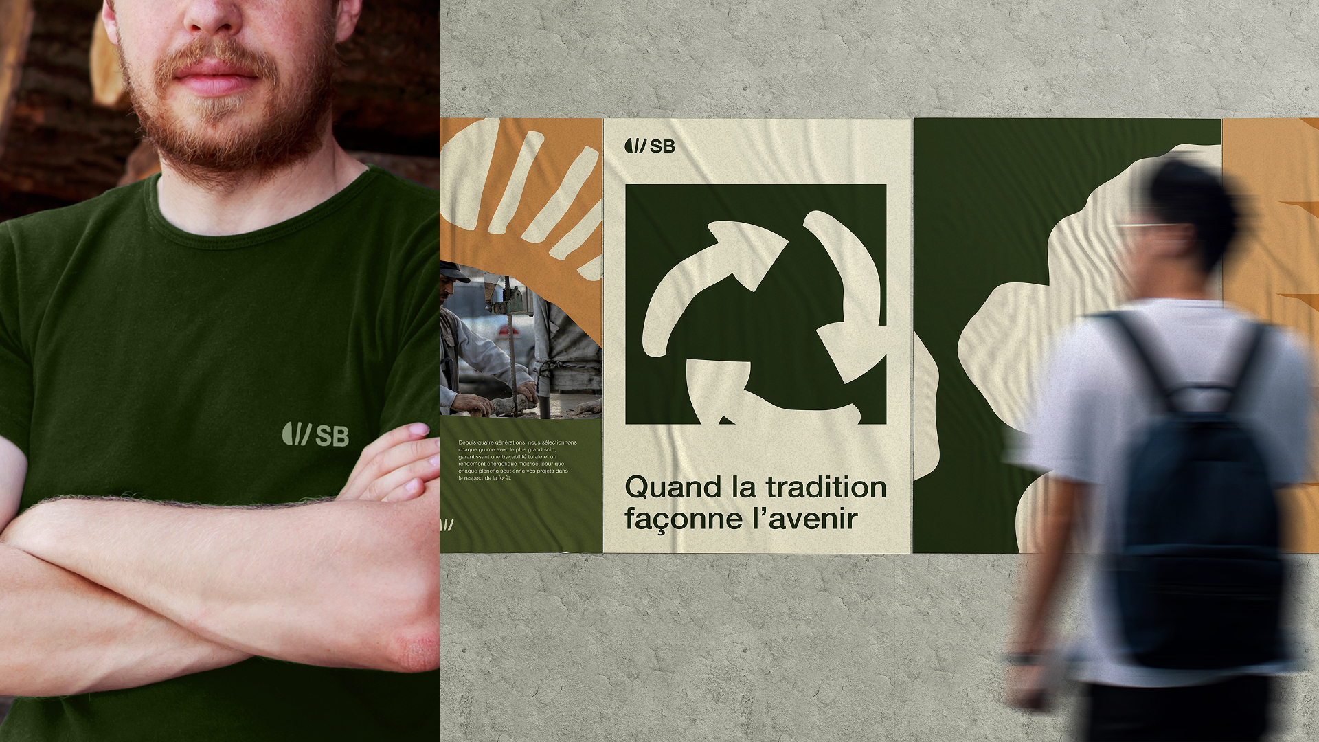
A rebrand for the fictional Scierie Badinter, a multi-generational family sawmill modernizing its image while honoring its craft. The wordmark is built like a stack of logs, paired with a hand-cut stump symbol whose irregular curves contrast the geometric Helvetica wordmark. A palette of forest greens, cream and warm browns roots the brand in the natural codes of the wood industry — institutional rigor meets artisan warmth.
The Scierie Badinter, a family business spanning several generations, asked for a visual identity that would put forward both its know-how and its commitment to a sustainable exploitation of wood. The competitive analysis revealed that sawmills tend to have dated logos with literal tree representations and almost no presence on social media — leaving plenty of room to stand out. The brand had to address two very different audiences: construction and civil engineering companies looking for stable, certified suppliers (PEFC, FSC), and local artisans (carpenters, joiners) drawn to a human-scale, passionate partner. The identity bridges those worlds: a stacked-logs logotype suggests the slope of a wood pile, a hand-cut stump symbol injects craft, and the Helvetica Neue family carries the institutional reliability. Forest green, cream white and a warm wood brown anchor the brand in the natural codes of the trade. The name itself is a quiet, dark-humour nod — Badinter, the lawyer who fought the guillotine, applied here to a sawmill.